SHIELD Health Informatics composite
Project Brief
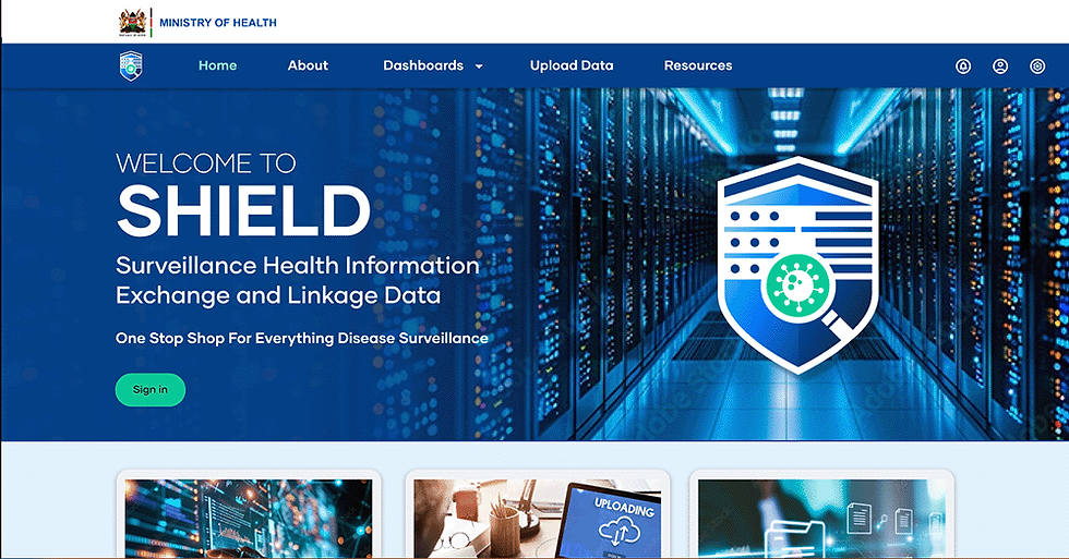
The Surveillance Health Information Exchange Linkage Data (SHIELD) system is a centralized data repository developed by the Ministry of Health (MOH) to facilitate seamless access to disease surveillance data, enhancing public health planning and response.
Key implementation partners include ICAP Kenya (Columbia University Mailman School of Public Health), the Centers for Disease Control and Prevention (CDC), and the Kenya Medical Research Institute (KEMRI).
User Needs
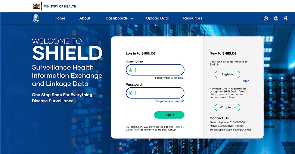
The Ministry of Health sought to improve SHIELD’s functionalities by establishing a distinct brand identity and incorporating a clean, modern UX/UI design focused on easy navigation and user engagement.
My Role
I led the creative and design direction for the project, focusing on:
-
Brand Development: Led the creation of a cohesive brand identity by defining the logotype, color palette, photography and art direction, iconography, and typography, seamlessly integrating these elements into a unified digital design system.
-
Architecture and UX/UI Design: Redesigned the user interface for enhanced usability and appeal.
-
Delivered a fresh, modern website aligned with the new brand attributes and improved user experience.
Design Process
The design process began with synthesizing user research from field testing to uncover key pain points in the dashboard's functionality and limitations. I collaborated extensively with a multidisciplinary team, including project leads, informatics managers, system developers, UX researchers, QA specialists, DevOps, and technical writers, ensuring a holistic approach to problem-solving. From there, I developed and implemented tailored design solutions across various website components, aligning each element with user needs and overarching project objectives.


